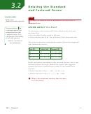
Graphical Approach For Cvp Analysis (Break-Even Chart) Worksheet - Chapter 3
ADVERTISEMENT
91
Chapter 3
| Break-Even and Cost-Volume-Profit Analysis
|
Graphical Approach for CVP Analysis
17.
3.2
(Break-Even Chart)
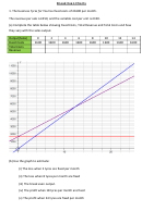
A break-even chart is a graphical representation of the following on the same axes:
1.
Fixed costs
2. Total costs at various levels of quantity produced
3.
Total revenue at various levels of quantity sold
The vertical axis (Y-axis) of the graph represents total cost or total revenue (in dollars) and the
horizontal axis (X-axis) of the graph represents quantity of items produced or sold (in number
of units).
These graphs are useful tools in break-even analysis and make it easy to observe how total costs
and total revenue change with the quantity produced and sold. It also makes it easy to see at which
point neither profit is made nor loss is incurred in the business (i.e., break-even point) and the
amount of profit or loss if the quantity produced and sold is known.
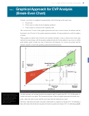
Exhibit 3.2: Graph of Total Costs vs. Quantity Produced and Total Revenue vs. Quantity Sold
The quantity produced
As sales increase, net income becomes less negative until it equals zero (NI = 0). At this point, it
and sold above the break-
reaches the break-even point. The intersection point of the two graphs represents the break-even
even volume will result
in a profit for a business
point, where the total revenue and the total costs from the business are equal.
while that below the
break-even volume will
Therefore, sales before the break-even point would result in a negative net income (NI < 0) indicating a
result in a loss.
loss, while sales after the break-even point will result in a positive net income (NI > 0), indicating a profit.
ADVERTISEMENT
0 votes
Related Articles
Related forms
Related Categories
Parent category: Education
 1
1 2
2 3
3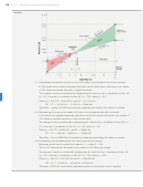 4
4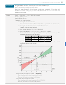 5
5 6
6 7
7